

Meliosight
Sharp where it needs to cut. Fluid where it needs to move.
Meliosight
Sharp where it needs to cut. Fluid where it needs to move.
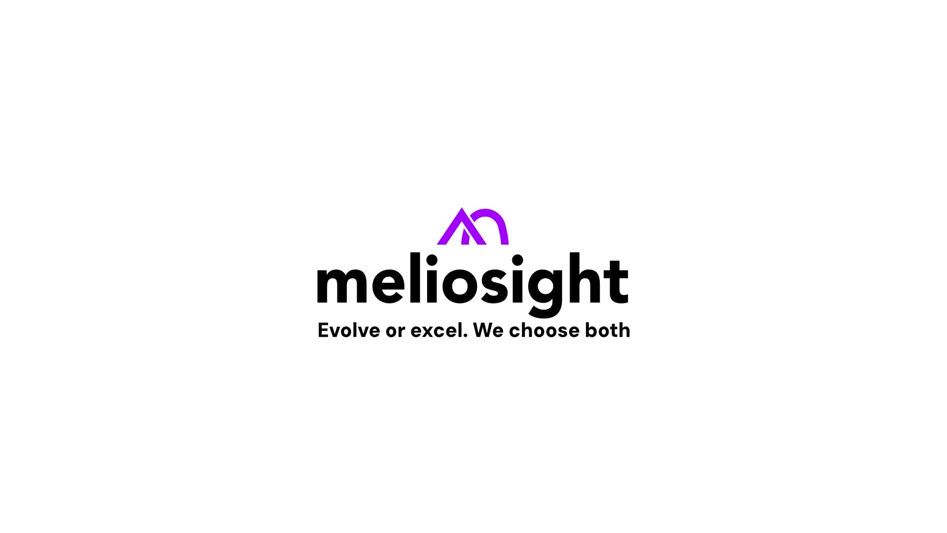
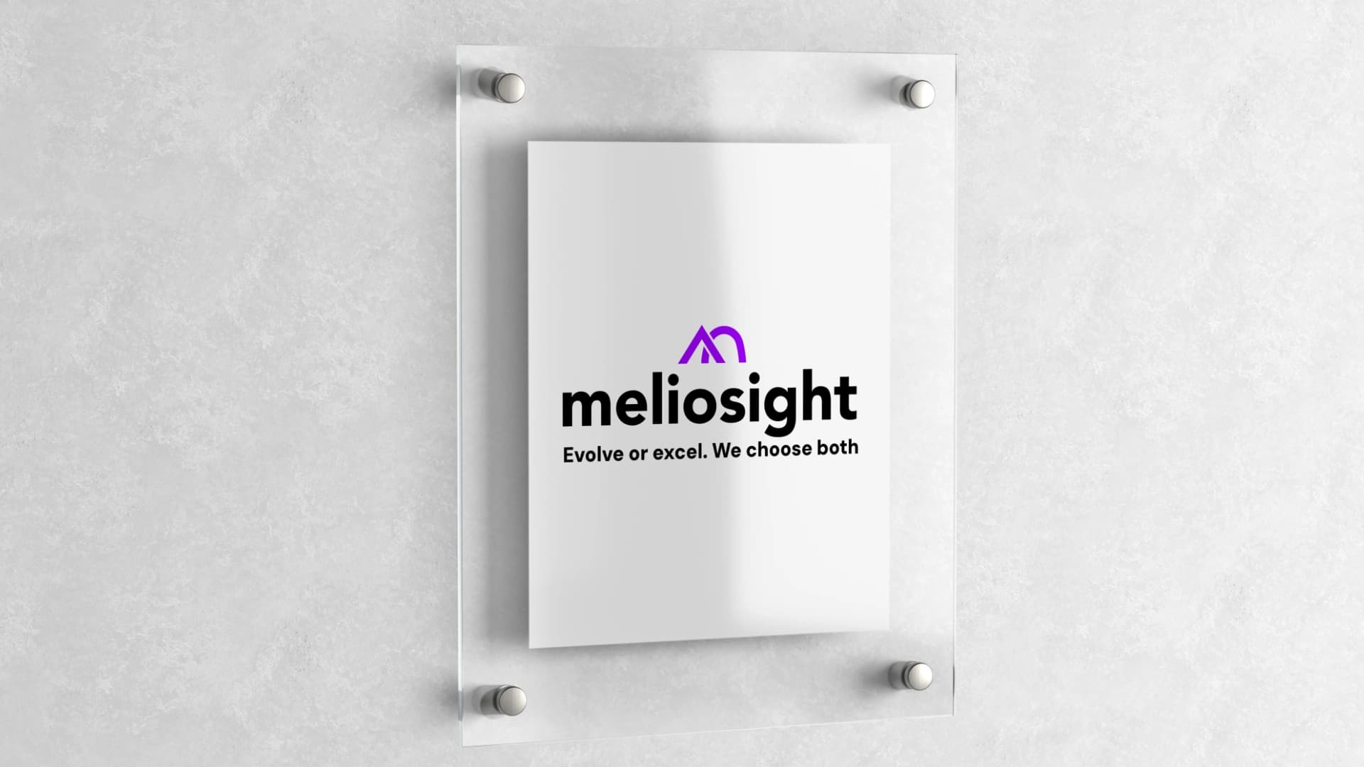
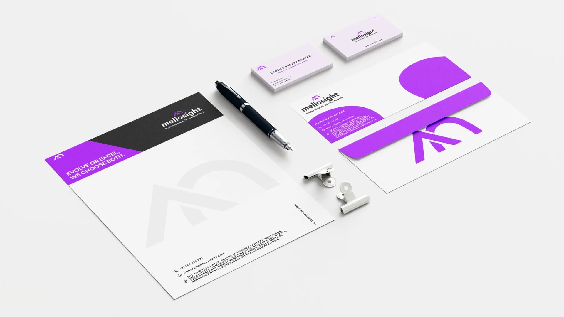
Designed a complete logo and brand identity for Meliosight - a firm that merges youthful entrepreneurial energy with seasoned consulting expertise. The challenge: capture both sides of that tension in a single cohesive mark. Sharp edges for precision. Curves for adaptability. One identity that communicates both without compromise.
Situation
Meliosight sits at an unusual intersection - young entrepreneurs with fresh energy backed by seasoned consulting expertise in strategy, technology, and operations. That duality is their strength. But it's notoriously hard to brand.
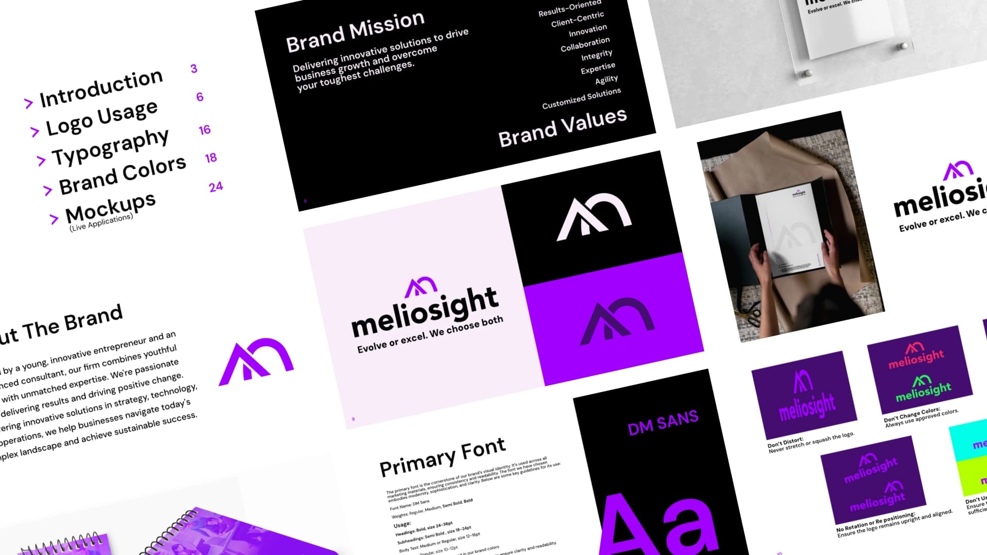
The brief called for a mark that communicates Innovation, Collaboration, Integrity, Expertise, and Agility. Not as a checklist - but as a felt experience the moment someone encounters the brand.
Solution
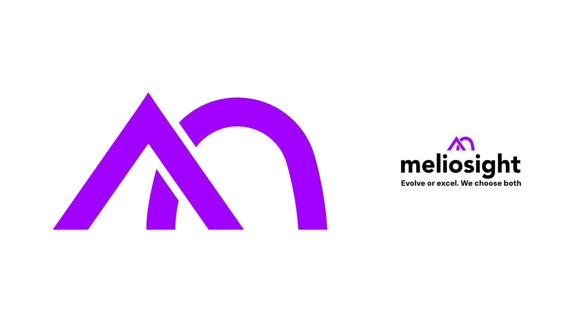
The identity was built on a fundamental tension: sharp edges versus curves. Sharp edges signal precision, cutting-edge solutions, and forward momentum. Curves suggest creativity, flexibility, and the ability to navigate complexity without brute force.
Neither dominates the other. The mark holds both in dynamic balance - a visual metaphor for exactly how Meliosight operates: decisive where decisions are needed, adaptive where they aren't.
Outcome
A brand system that speaks to two audiences simultaneously - the energetic startup clients who respond to the forward momentum, and the enterprise buyers who need to see the precision and depth behind it.
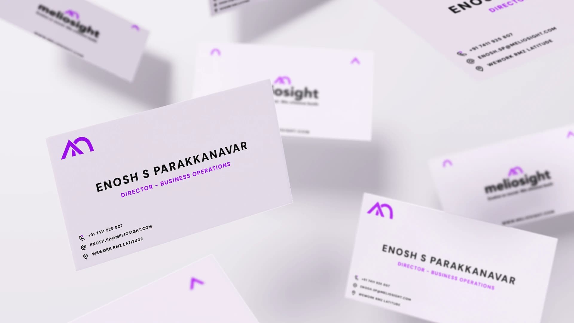
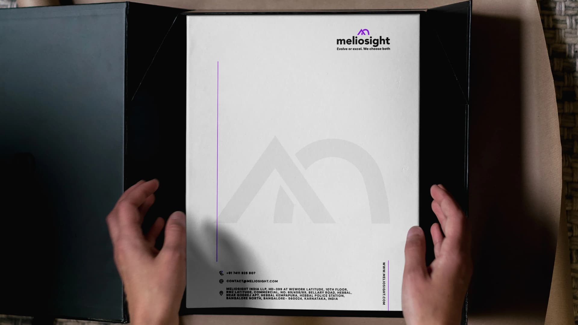
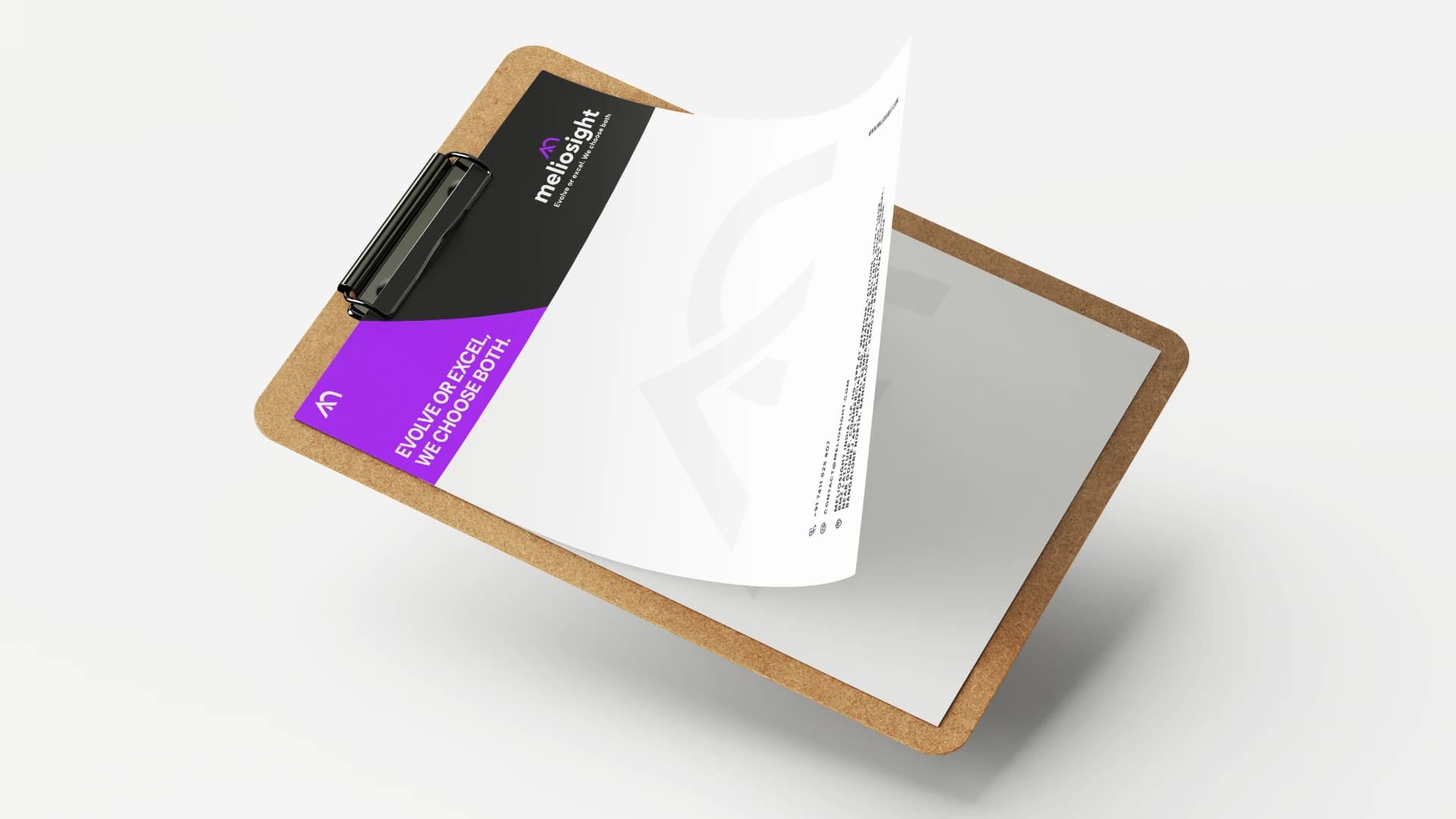
The identity scales across pitch decks, digital interfaces, merchandise, and physical print without losing its essential character. Meliosight now looks as sophisticated as the solutions it delivers.







Other Projects