
Joint Hands
When the land speaks, the brand should too.
Joint Hands
When the land speaks, the brand should too.
Designed a complete visual identity for a grassroots collective of tribal women farmers in Thalavady, Tamil Nadu - an organization rooted in forest produce, agricultural inputs, and collective empowerment. The brand needed to represent their land, their heritage, and their mission in a single, scalable visual system.
Situation
Joint Hands Women Farmers Producer Company Limited is a grassroots cooperative based in Thalavady, Tamil Nadu - representing tribal women engaged in value-adding forest produce and agricultural inputs like fertilizers and pesticides.
Without cohesive visual branding, the organization struggled to project the credibility needed for institutional partnerships, vendor trust, and community recognition. They had the mission. They needed the identity to match it.
Solution
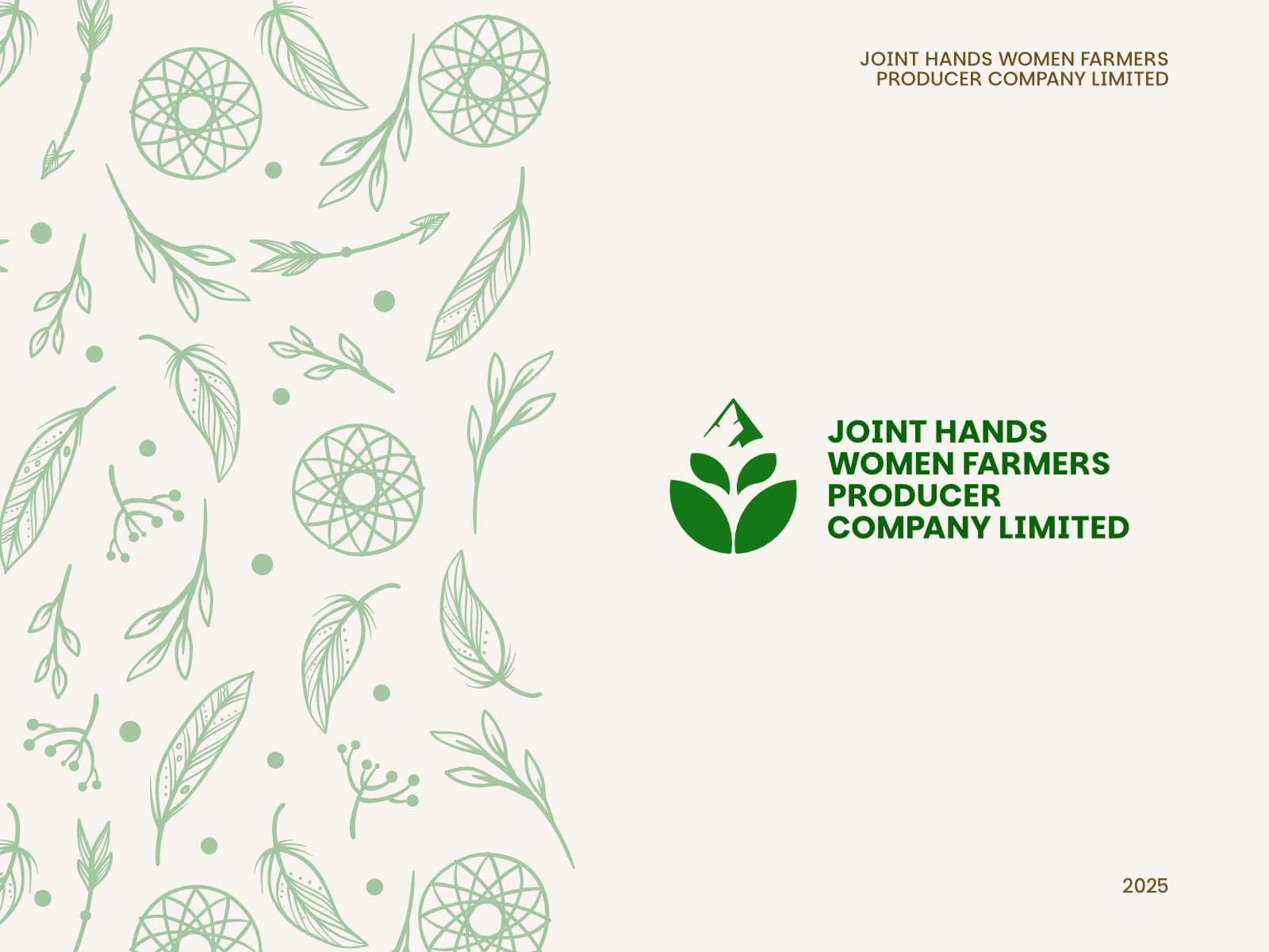
The logo anchors on a mountain-top silhouette drawn from Thalavady's actual terrain, combined with a three-leaf formation that symbolizes growth, agriculture, and collective empowerment - all three pillars of the organization in one mark.
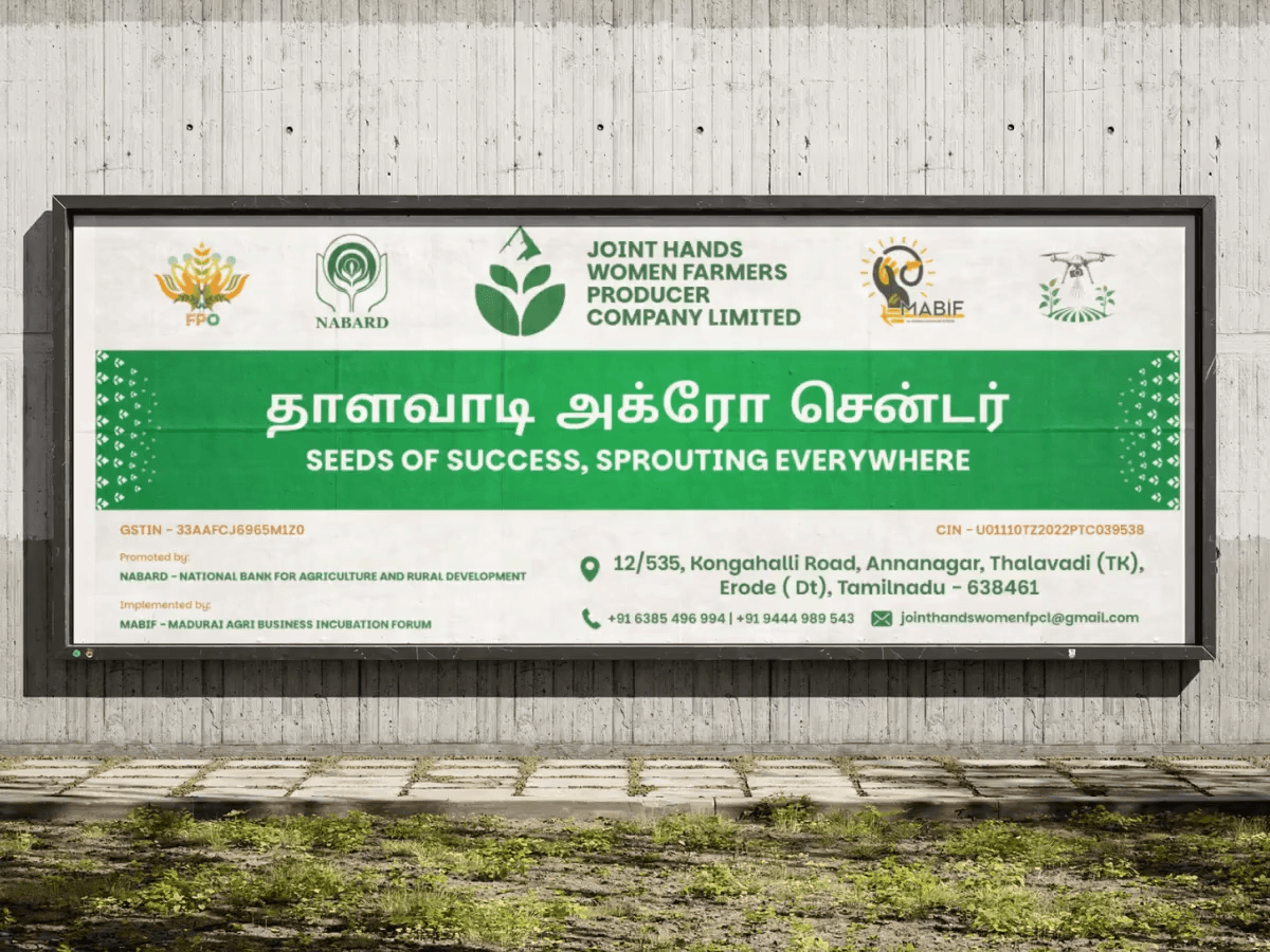
A faceless woman farmer mascot was illustrated wearing an earth-toned saree and green blouse, sickle in hand - faceless by design, so every woman in the collective could see herself in it. Stationery, signboards, and a full letterhead system completed the identity.
Outcome
A unified brand presence that reflects the organization's mission, geography, and community. The identity now scales from printed letterheads for government correspondence to roadside signboards readable from a distance.
Partners, vendors, and local bodies now engage with Joint Hands as the professional, mission-driven organization it has always been.
A brand that doesn't reflect who you are will always feel borrowed. Joint Hands deserved a mark that was entirely theirs.
Other Projects