The Kushi Grafixx brand, in one place.
Everything Kushi Grafixx looks like, from the logomark to the last token. Copy any value, download any file, and check any colour pairing before it ships.

Principles
Six rules sit above every token and file. When a case isn't covered anywhere else on this page, these decide it.
Ink first, Paper second
The website lives on Ink and nowhere else. Light belongs to documents first and to social posts, sparingly.
Ink #0C0C0C · Document #FFFFFF · Paper #F4F4F2Editorial, not bubbly
Corners stay sharp and radius stays minimal. Layout breathes through spacing and hierarchy, not soft shapes.
The one exception: CTAs are full pills.Red is the accent, not the palette
Kushi Red marks focus, action and brand moments. If everything is red, nothing is.
One accent moment per viewport. See 3.2.Tokens before values
Never hardcode hex, px or ms. Change a token and the whole system updates, including this page.
Brand → Alias → Component.One voice in type
Outfit carries everything. At most two weights per layout and three sizes per section.
No monospace, anywhere.Motion with purpose
Transitions confirm an action; they don't perform. Default to 200ms ease-out.
A static state must still read as finished.Logo
Two forms: the KG monogram and the full lockup. Use the supplied files in their approved colourways; never redraw, retype or recolour them.
Clear space
One K-height on every side. Nothing enters that zone: no type, no edge, no other mark.
Versions
Each version is drawn on the ground it was made for. The lockup carries red in its wordmark, so on Kushi Red use the mono monogram.





Minimum size
Shown at actual size. Below 80px of width, switch the lockup for the monogram.
Misuse
- Stretch, squash, rotate or skew the mark.
- Recolour it outside the approved versions above.
- Put the full-colour lockup on Kushi Red.
- Add shadows, outlines, gradients or glows.
- Retype the wordmark in Outfit or any other face.
Co-branding & credits
Most Kushi Grafixx work lives on someone else's brand. The client's mark always leads; ours signs off.
Identity by Kushi GrafixxSite by Kushi Grafixx- Never set the Kushi Grafixx mark larger than the client's.
- Never recolour either mark to match the other. Each keeps its own approved version.
- No credit on a client's own product, app or packaging front without written agreement.
Colour
Four colours carry the brand. Ink and Kushi Red belong to the identity; Document and Paper exist for the printed and posted word. Click any value to copy it.
Palette
Usage ratio
Red is a scalpel, not a paint bucket. In documents, white takes the base role; on social, Paper does.
Fig. 3.2 — Surface share by role. Red covers the logo mark, the primary CTA, active states and focus rings. Never a full-bleed field, never body text.
Contrast
WCAG 2.1 ratios, computed from the palette rather than typed in. Failing pairs stay on the grid: they are the ones worth knowing.
- AAA7.0 and up · any text
- AA4.5 · body text
- AA LARGE3.0 · 24px+ or 19px bold
- FAILbelow 3.0
Typography
One family, Outfit, does every job. Hierarchy comes from size and weight, never from a second typeface. The website keeps 400–700; 300 and 200 belong to social, print and campaign work.
Type scale
Read-only. One H1 per page, at most two weights per viewport. Light (300) never below 18px; ExtraLight (200) never below 64px.
Layout & motion
The working layer: how space, corners and time are measured. Every value is a token; the token number × 4 is the pixel value.
Spacing & grid
A 4px base step from 4 to 128. On a 1440 board the outer margin is 72px and content is 1296px wide.
Radius
Small, and from the scale only. Images and figure plates are never rounded.
Motion
--speed and --ease (200ms ease-out) by default. Springs only for modals, toggles and hero reveals. Every animation respects reduced motion.
Textures
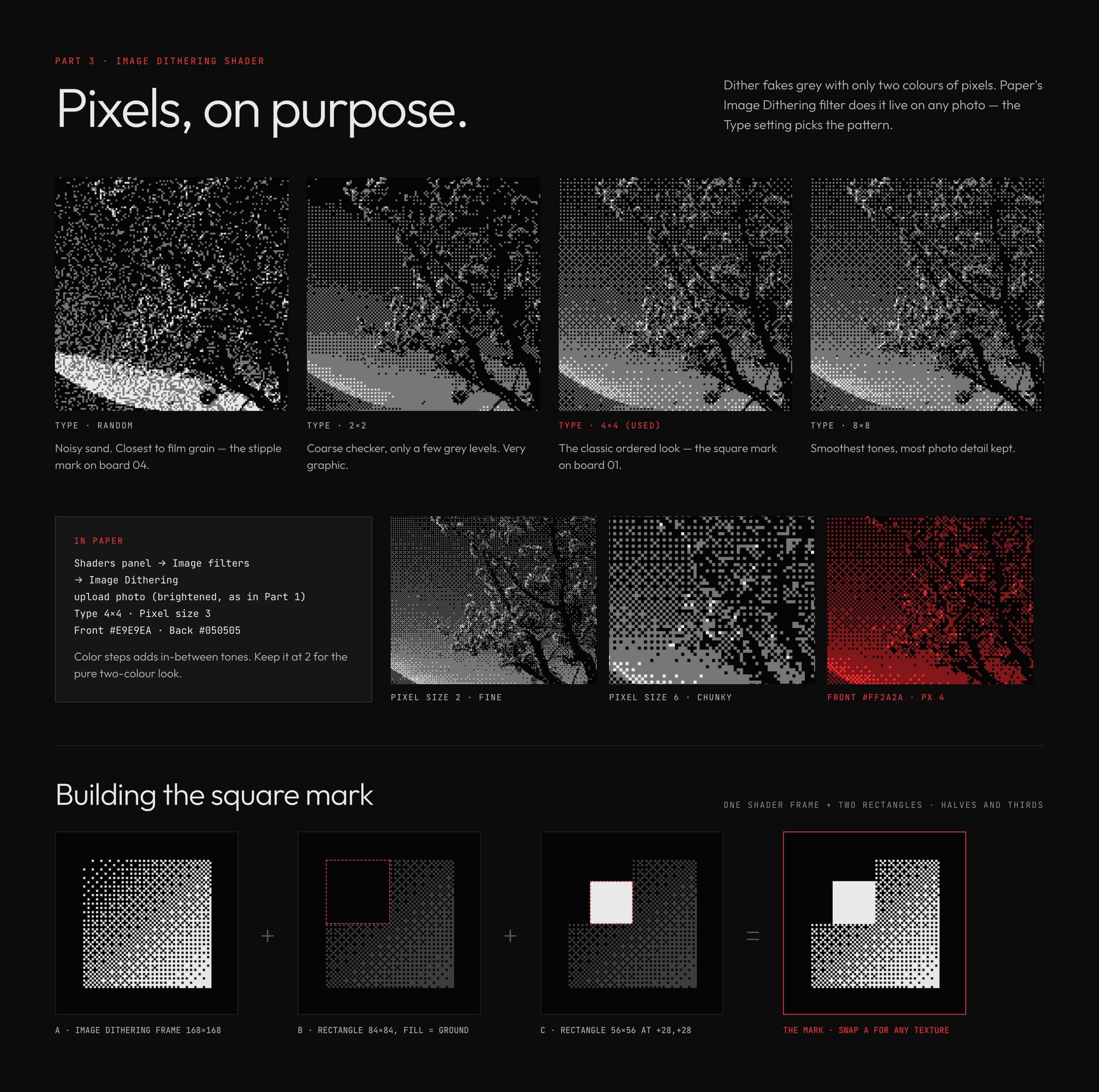
Six code-generated surfaces, seeded and locked to the palette. Download the raw layers, place them over a flat ground, and follow the opacity and pairing rules below.
Raw files
The texture layer alone: transparent PNG, no type, no graphics. Shown here on the ground each one is made for. Files marked "tiles" repeat seamlessly at any size.







Usage
A texture is always a layer over a flat ground, never the ground itself. Two textures per layout at most, and never over body copy.
In use
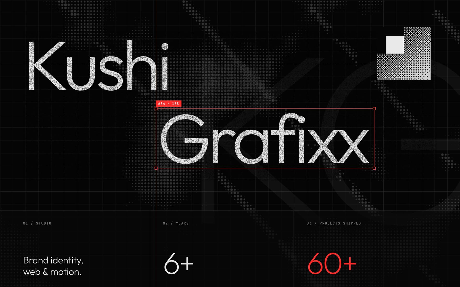
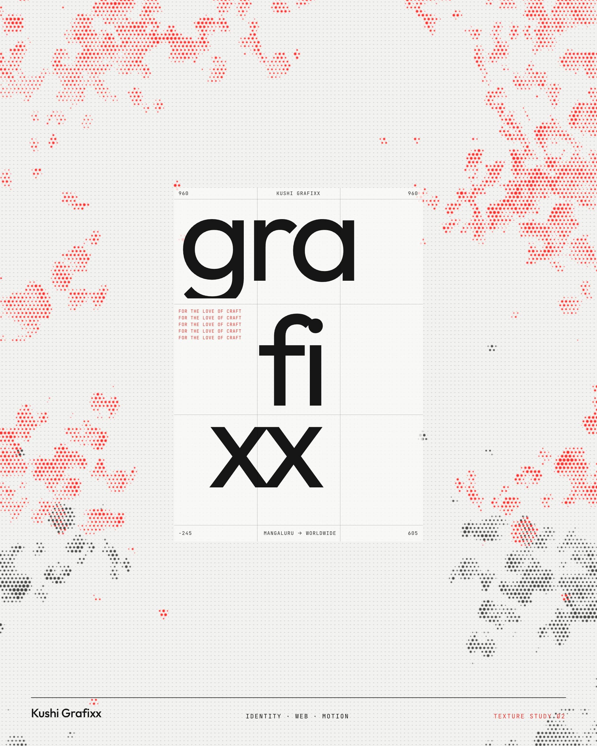
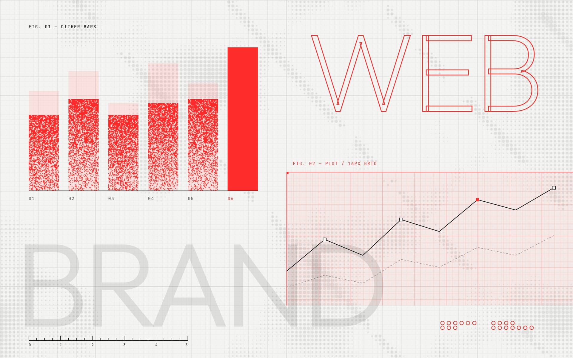
Reference compositions showing each texture at work. They are examples to learn from, not files to reuse; build from the raw layers in 6.1.

Iconography
One icon family, Phosphor, in its Regular weight. Its even 1.5px line sits with Outfit 400–500 without either one shouting.
The set
Phosphor Regular, MIT licence, 1,500+ icons. Shown at 24px. Search phosphoricons.com before drawing anything custom.
Sizes & pairing
Four sizes, each matched to a text size. The icon centres on the text's x-height, 8px away.
Rules
Do
Colour icons with the text beside them. Red only for an active or focused state.
Use arrow-up-right for links that leave the site, arrow-right for links that stay.
Give icon-only buttons a text label for screen readers.
Don't
Mix weights. Bold, Fill and Duotone stay in the font files, not in layouts.
Mix icon families, or redraw a Phosphor icon in another style.
Put icons inside circles or tinted tiles. They sit on the surface.
Imagery
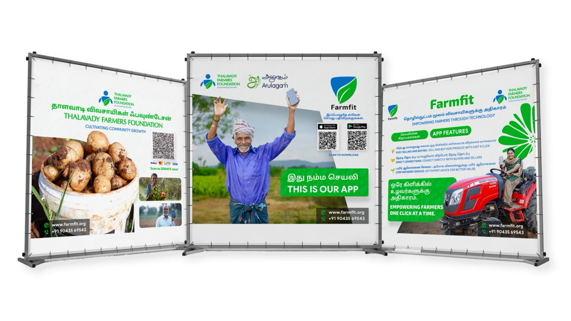
The work is the imagery. Show client identities in the places they live, at real scale, in the client's own colours.
The work in context
Mockups that place the identity in its setting: a stall, a billboard, a bag. One subject per image.


- Keep the client's colours exactly as delivered. Never regrade their work toward Ink and red.
- Prefer real photographs of delivered work over mockups whenever they exist.
- No stock photography, AI-generated people, or mockups with visible watermarks.
Cover treatment
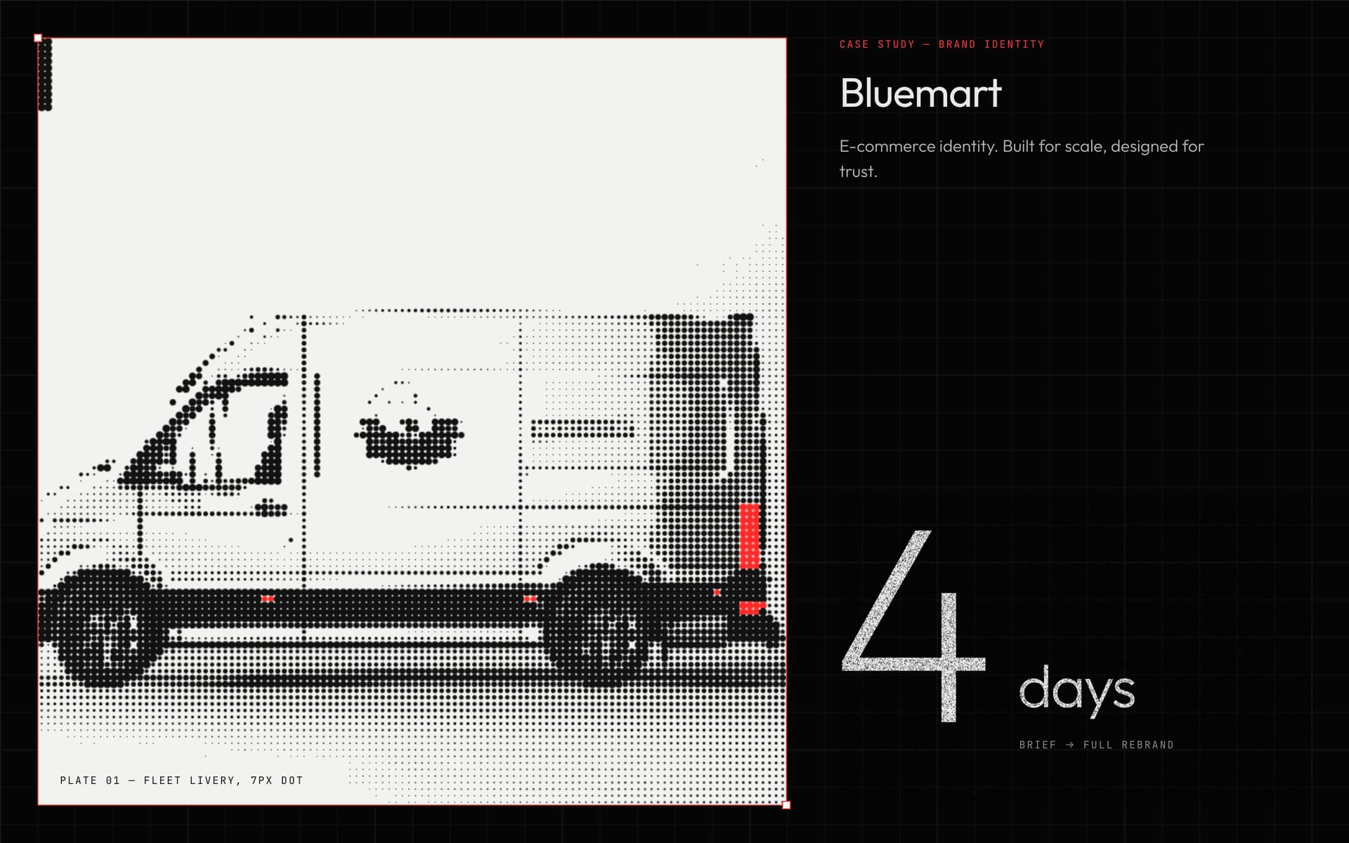
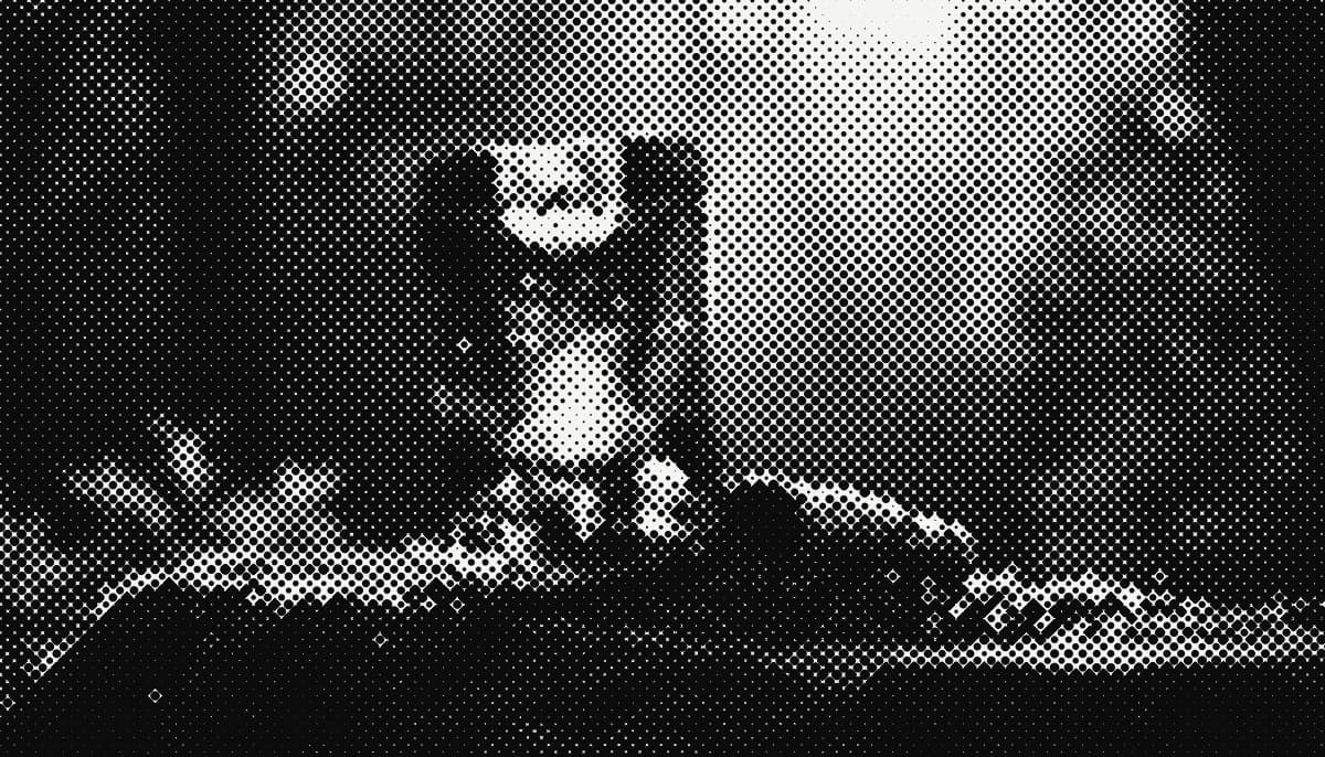
Case-study covers and editorial posts may re-screen a photograph with the T.05 halftone screen. Inside the case study, show the work untreated.

Crops
Three ratios cover every surface. Keep the subject inside the centre two-thirds so all three crops hold.
Portrait
Two approved images of Kushi, each with one job.
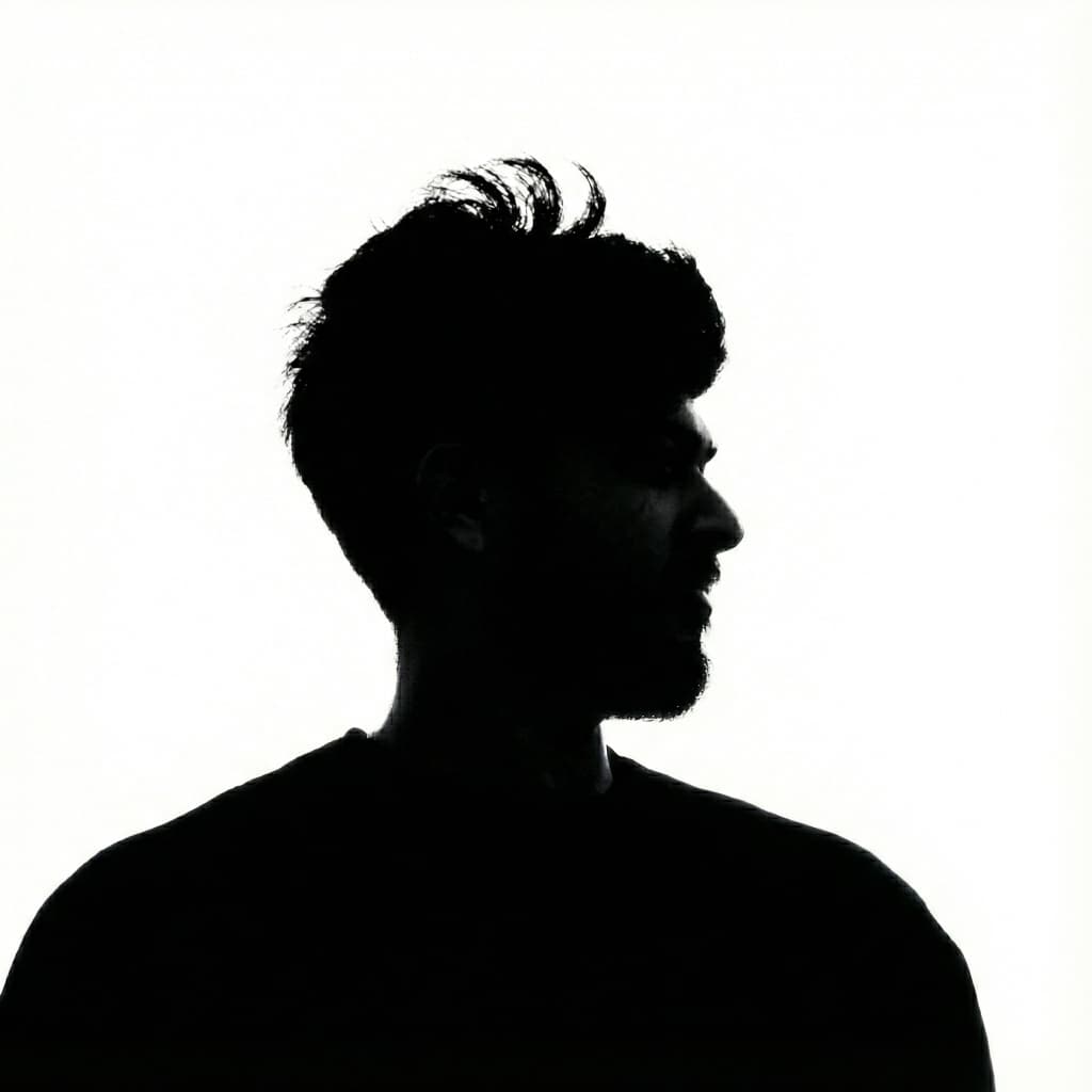
Silhouette on white. For press, speaker bios and partner pages. No credit required.
The live particle portrait on /about. It is the only portrait on the website; never swap it for a plain face photo.
Applications
The identity at work: profile pictures, stationery, social and web templates, decks, email and browser. Each one follows the same red budget and the same grid.
Profile pictures
Stationery
Card front on Ink, everything that carries text on Document white. Red appears once: the mark.
Proposal · KG-P-041Social media
Rules for every post, not finished posts. Pick the format, build on the grid, keep to the red budget. The editable templates are in Downloads.
Margin: 80px on every side. Nothing but the ground and textures crosses the dashed line.
Results, launches, numbers and case reveals. Pairs with silver grain, Bayer dither and red stipple.
Opinion, process notes and carousels. Pairs with graph paper and the halftone field. Never Document white on social.
Do
One message per post. Carousels get one idea per slide.
Use Outfit 200 and 300 for headlines. Social is where the light weights live.
Keep textures at 10–35% opacity, under the type.
Quote clients word for word, with their name and company.
Don't
Fill a post with Kushi Red, or set body copy in it.
Put the full lockup on a post. The monogram signs it.
Use stock photography, emoji or a second typeface.
Stack more than two textures, or let one cover the type.
Presentations
Decks are documents: Document white, one Display Light title per slide, the running head from this page. Ink is reserved for the cover.
Email & browser
The smallest surfaces. Signatures are text plus a 24px monogram, never an image of the lockup. Favicons use the monogram on Ink.
Kushi Grafixx — Brand…180 · 512 maskableVoice & press
How the name is written, how the work is described, and the approved copy for anyone writing about Kushi Grafixx.
Naming
KushiGrafixx, Kushi Graphics
“The studio”, “the agency”, “the team”
KG in running text
Boilerplate
Copy either version as-is. The portrait is approved for press; no credit required.
Kushi Grafixx is an independent brand identity designer based in Mangaluru, India, working remotely with founders and teams worldwide on identity, web and motion.
Kushi Grafixx designs brand identities for early-stage companies: the logo, the system around it, and the website and motion that carry it into the world. Fully remote from Mangaluru, Kushi documents every system built, so the brand still holds together long after handoff.
Downloads
Every file is rendered from this page's data at build time, so what you download always matches what you read.

Using the mark in press or partner material? Take the media kit: every logo plus the textures, templates and press portrait.
kg-media-kit.zip 6.5 MBRevision history
Colophon — Set in Outfit. Issued by Kushi Grafixx, Mangaluru. To cite: Kushi Grafixx, “The Kushi Grafixx Brand Guidelines”, Ed. 4.1, October 2026, kushigrafixx.in/brand. The Ed. 3.2 component reference stays at /brand/reference.